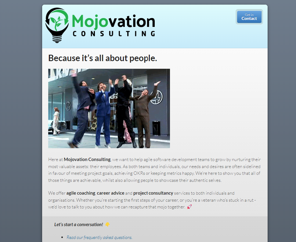
It’s exactly two months since I first registered the mojovation.co.uk domain name and secretly published an empty website. We’ve come a long way since then. If this isn’t your first visit to the site, then you’ve no doubt already noticed a few big changes. But before we talk about where we’re at now, let’s talk about where we came from!
In the beginning…
As I revealed in the article about my Mojovation Planner, I’d been bouncing the name “Mojovation” around in my head since late June, when I began to use it as a catch-all term for my desire to make some big career changes. And at the start of July, my domain registrar was running a limited-time “Register a .co.uk domain for free” campaign - so I did what any nerd would do, and registered mojovation.co.uk, with no specific plans for it.
Changes quickly emerged as I began to solidify my career aspirations in my head. Initially, this blog began as an excuse for a daily writing habit: to keep my mind fresh for interviews and other career conversations. But as I began to develop a desire to launch a dedicated coaching service, the name “Mojovation Consulting” was born.

For the sake of posterity, here's a screengrab of v1 of the website.
The site did what I needed it to do, at that moment in time. It was a hub that I could point to during conversations with clients, and the relationship turned out to be reciprocal, insofar as my coaching conversations spawned a bunch of ideas for new articles.
Yet I wasn’t completely happy with the site. The theme, in particular, was driving me mad: there’s a relatively small number of supported themes for GitHub Pages, and while the theme above (Modernist) seemed to be the best of them, it clashed horribly with my subsequently-designed logo, and - as per the screenshot above - the font had a habit of degrading horribly on UHD monitors. But this was all part of the learning process, and set me up for where we’re at today.
What’s new?
We’ve given the whole site a visual overhaul. The site now uses the Minimal theme, albeit tweaked to utilise more screen real-estate, and with some CSS tweaks which allowed me to carry-over some of my favourite aspects of the Modernist theme. One of my favourite visual changes is that the article listings on the homepage and blog archive now utilise a “gallery view” which makes them appear much more dynamic, and means that all of that time searching for apt GIFs wasn’t totally wasted.
But the changes are more than just surface-level. The previous iteration of the site had some vague messaging around our coaching packages, primarily because I was still working with clients to determine what those packages should look like! The new version of the site has much clearer messaging around what we do and the service packages we can offer. There are also some changes which look small, but were fun to put together, such as the dynamically-loaded data from my Ecologi profile which is visible in a couple of places on the site.
We’ve also settled into a regular cadence for publishing content on this site:
- Mondays: New blog post
- Tuesdays: New blog post
- Wednesdays: New video upload (starting soon!)
- Thursdays: Live “Office Hours” on Twitch (starting soon!)
- Fridays: New book review
You can always subscribe to our RSS feed to keep up-to-date.
What’s coming next?
This is the next iteration, but we’re not finished. We’re learning from feedback all of the time, and there will be more improvements to come. Ultimately, this site exists to start communication with like-minded people about the challenges in our working lives, and for as long as there are issues for us to tackle, we’ll be here!

